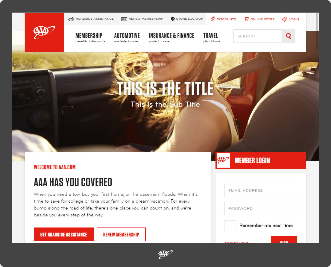
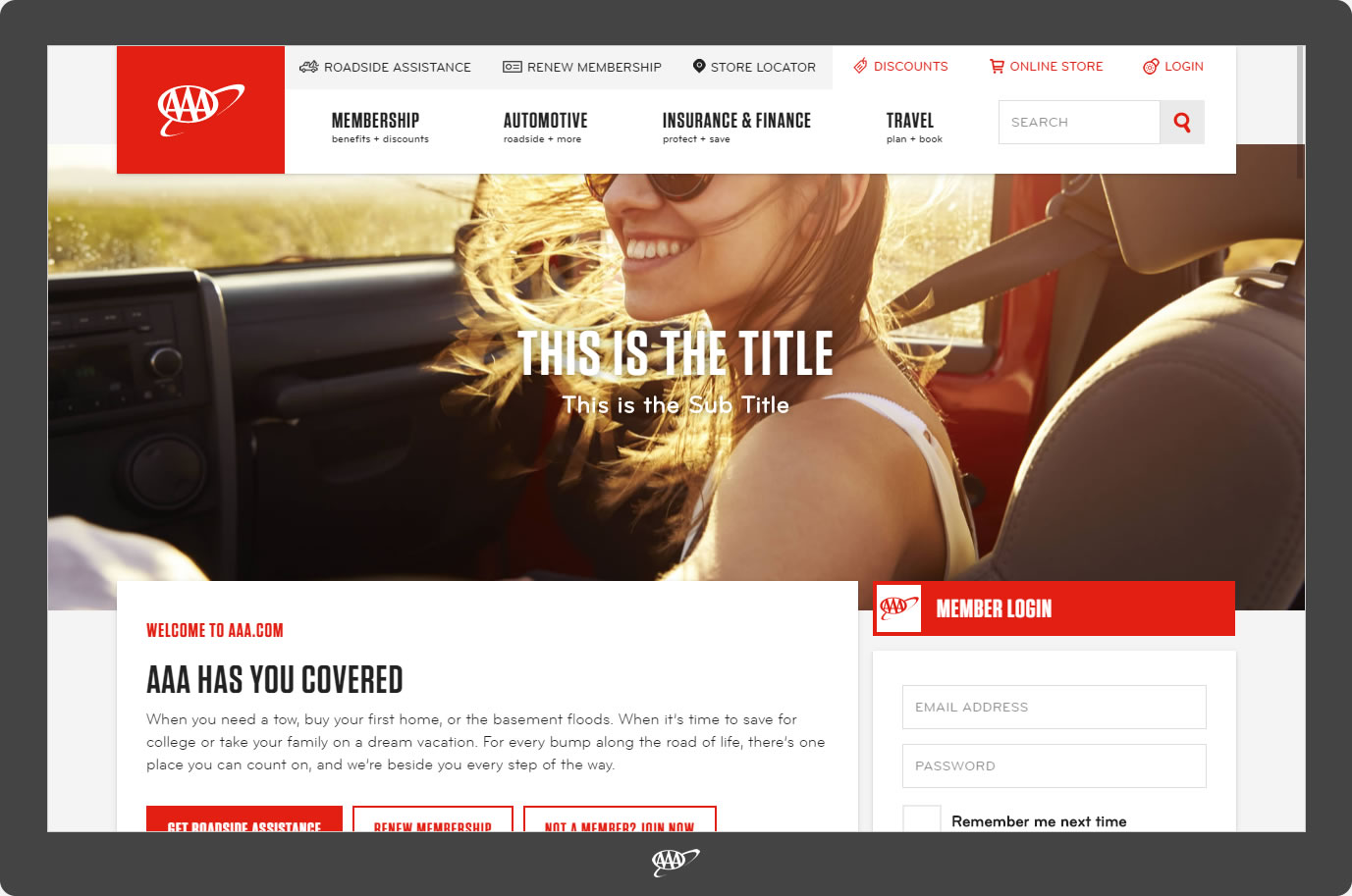
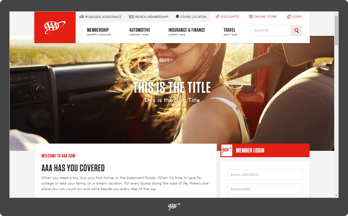
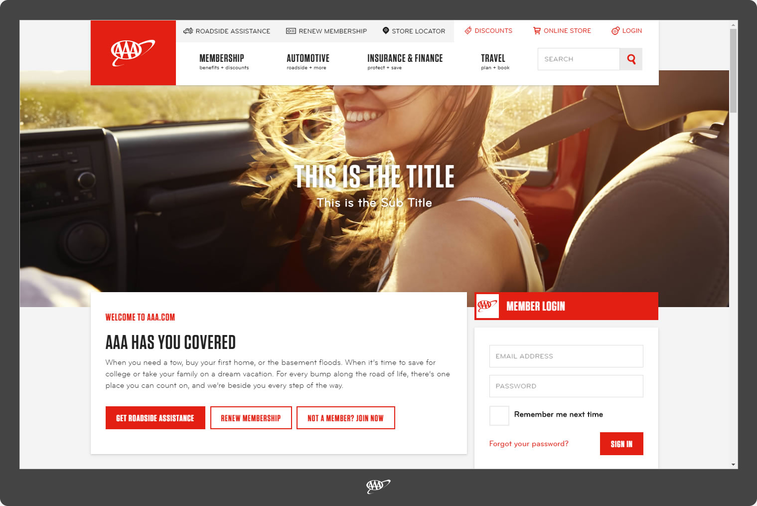
Viewport Screens and Resolutions Snapshots
This page offers a visual representation of how the AAA app is viewed
through various size digital screens of some of the most popular viewport resolutions.
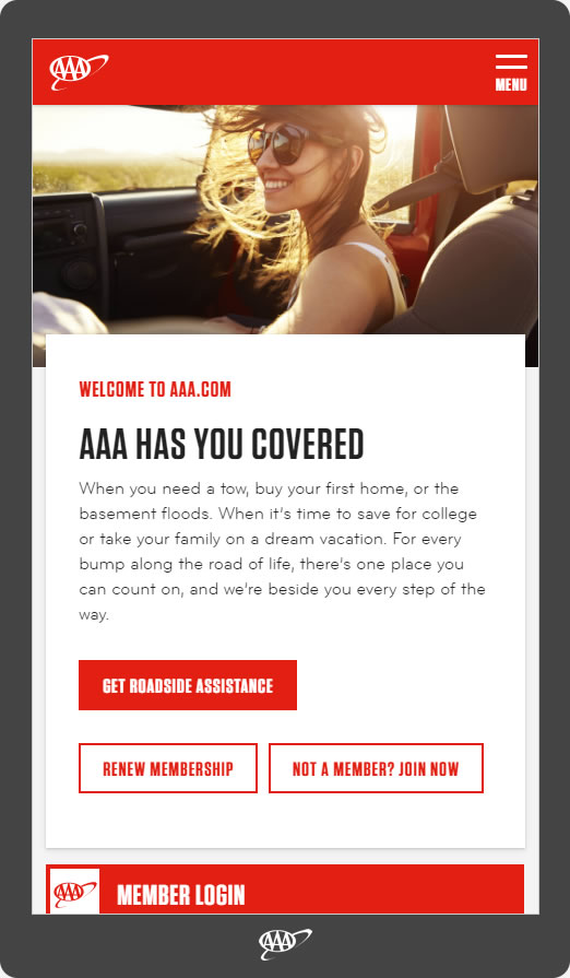
360 x 640

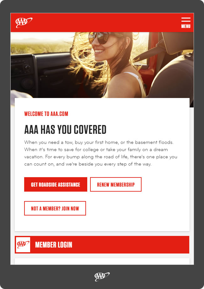
480 x 800
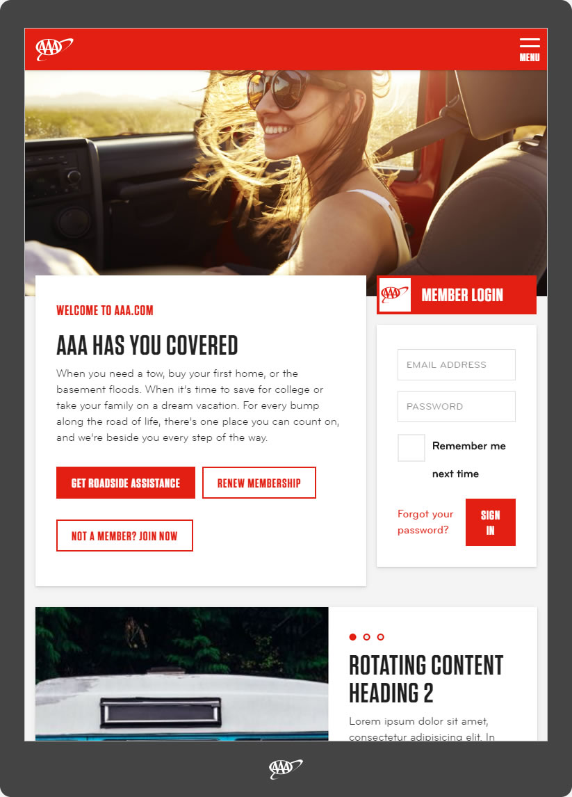
600 x 800
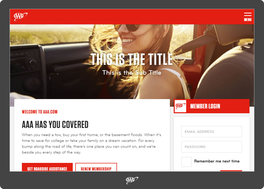
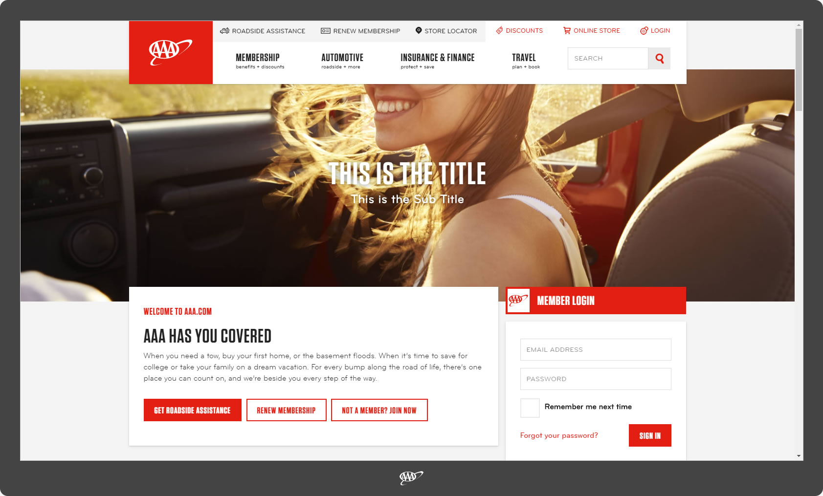
768 x 1024
960 x 640
1024 x 600

1024 x 768
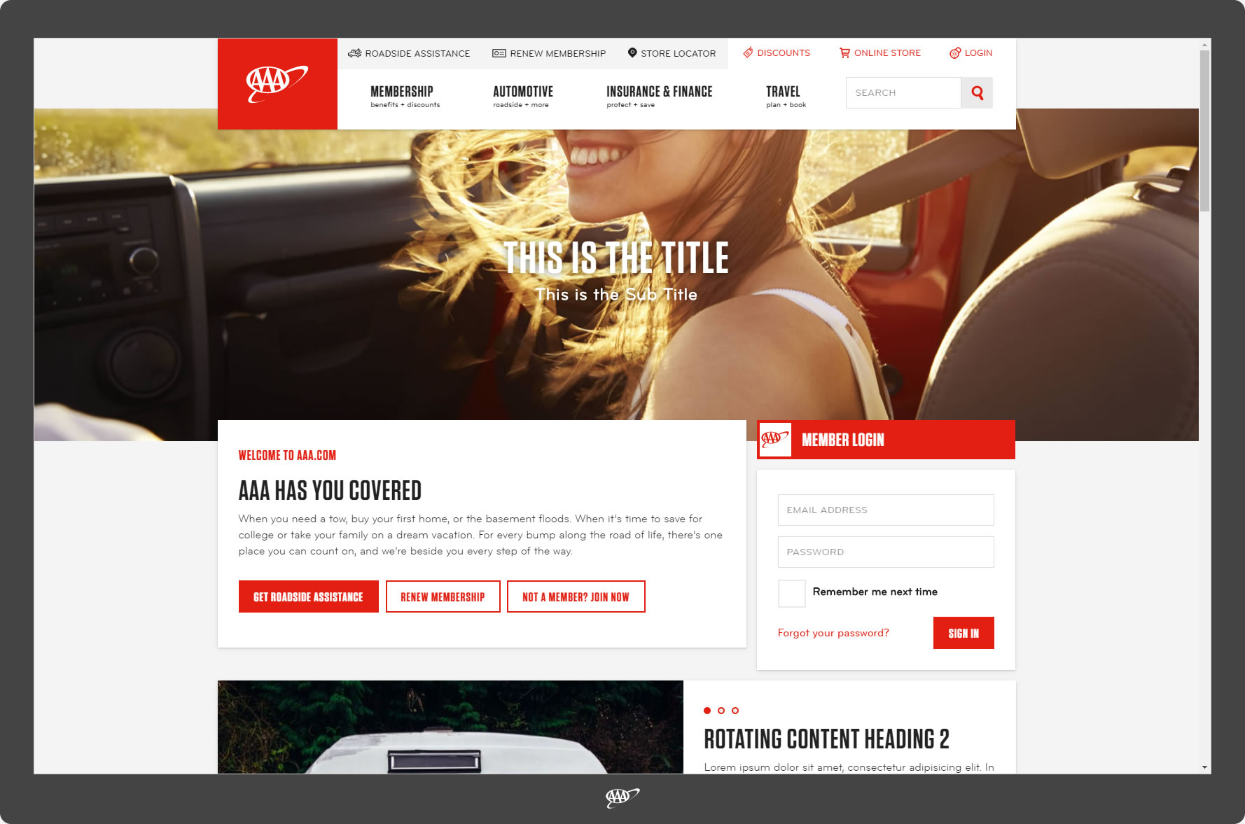
1280 x 800
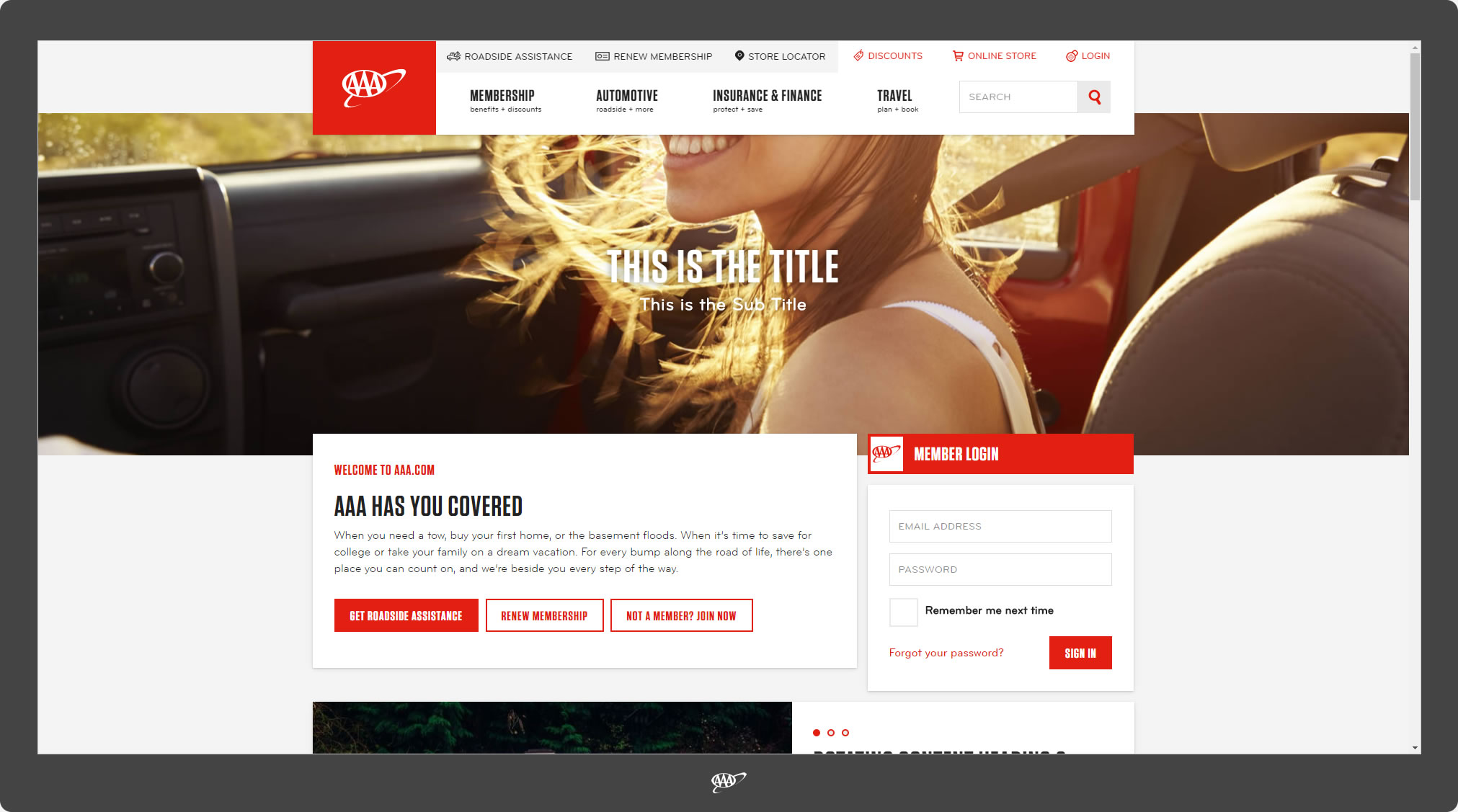
1280 x 1024

1360 x 768
1440 x 900
1600 x 900
1680 x 1050
1920 x 1080
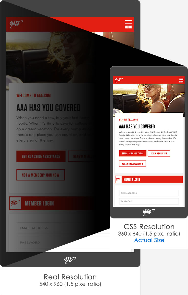
540 x 960 > 360 x 640
At this time, mobile devices have improved so much that their screen resolutions are
similar
and sometimes even better than desktop screens resolutions.
For example Galaxy S4 of Samsung has 1080X1920 pixels - Full HD screen!
But in responsive design we check resolution and need to fit according the resolution
and if
you try to add media query, let's say min-width of 1000px and check it on the Samsung
Galaxy
S4 you will see that nothing happened.
The reason for it is that mobile high density screen have two aspect of pixels.
Real resolution
The first resolution is the factory real resolution, it's mostly for videos and images.
on
Samsung galaxy S4 the real resolution is 1080X1920.
CSS resolution
The second resolution is for the browser. and for us developers that means we need to
act
different and not according the real screen resolution. in Samsung Galaxy S4, CSS
resolution
is 360X640.
Samsung Galaxy S4 resolution:
Real resolution: 1080X1920
CSS resolution: 360X640